

PROVIDING INSIGHT into the future for the rest of Canada is Canada's oldest median age community, Qualicum Beach, like the canary in a coal mine?
Qualicum Beach's changing population leads Canada's shift from above to below replacement fertility and more deaths than births (6 to 1). Last year, British Columbia's official statistical agency estimated the population for Canada's oldest (in terms of median age) town declined in 2013.
Is this a just a blip in an otherwise growing population? Or will the town's population increase as rapidly as the surrounding Qualicum District forecast, by the same official statistical agency, to increase by over 30%?1 Let's take a look.
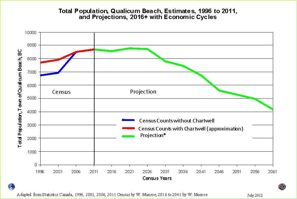
The only scenarios that show a decline in population (using cohort change ratios method based on the census counts from 1996 to 2011) are the low and the economic cycles scenarios. To create the economic change scenario, we can simply use the change that occured between each of the censuses from 1996 to 2011 and repeat these into the future.3
Using the same scenario, the total population for the town and the surrounding areas (the Parksville Census Agglomeration), will begin to decline after 2026. If current trends continue, the population decline will likely spread across Vancouver Island unless in-migration increases, well above current trends, to compensate for the rising number of deaths and the below replacement fertility.
Although all projections show a decline in population in the next 15 years, or so, the future may differ from the current demographic trends. For example, housing prices may drop with the decline in population resulting in an increase in vacancies particularly in the supply of single family housing. Consequently, this area may attract even more families; however, rising transportation costs may result in lower migration to the island as a whole.
1 The chart pretending to foretell the future.
2 The boundary expanded in 2005 to include an area known as Chartwell adding ~900 people.
Statistics Canada provides age and sex counts for 1996, 2001, 2006, and 2011 for Canada's census (dissemination) areas; therefore, this projection scenario does not benefit from censuses prior to 1996, rather they use only "current" trends, providing approximations of fertility (0 to 4 relative to Females 20 to 39 year old), life expectance ('survival ratios' to use the UN term for 'cohort change ratios'), and net migration by five year age groups.
To download census counts go to: Statistics Canada's website at http://www12.statcan.ca/census-recensement/index-eng.cfm. Be sure to read the footnotes and check for important information such as boundry changes, and non-response.
3 For example, if the change experienced between 1996 and 2001 occurs between 2011 and 2016 (economic downturn) followed between 2016 and 2021 by a change similar that which occured between 2001 and 2006, followed by a change between 2021 and 2026 similar to that which occured between 2006 and 2011, the total population will fluctuate marginally before declining in the late 2020s as seen in the chart.
Population Projection Project for Canada's Census Areas
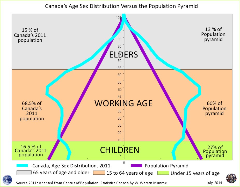
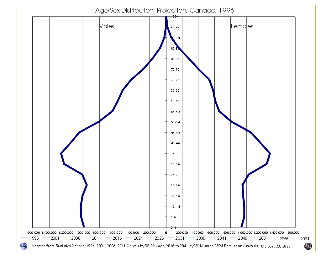 Take a look at Canada's Age Sex Distribution animated projection (medium scenario). The animation starts at 1996 and clicks through to 2041. Notice in the 1996 chart, the baby boom bulge (which is just the resumption of more births than deaths - the population pyramid - after WW2) followed by fewer numbers in the younger age groups reflecting (resulting from) reduced fertility beginning in the mid 1960s. This medium scenario projection is an average of the 1996 to 2011 cohort change ratios thus creating a central tendency that eventually provides smooth lines in the younger age groups by the end of the projection period.
Why are Statistics Canada's projections so high compared to the United Nations and the Cohort Change Ratios projections?
Government population projections for BC reflect an "up and to the right" aspiration, while the cohort change ratios method shows BC's population growth slowing, and levelling out. Read a "A Comparison of Population Projections for BC"...